# Option 2: Read directly from GitHub
# Load required libraries for each of the graphs (treemap, pie chart, 2d density, ridgeline)
library(tidyverse)
## ── Attaching core tidyverse packages ──────────────────────── tidyverse 2.0.0 ──
## ✔ dplyr     1.1.4     ✔ readr     2.1.5
## ✔ forcats   1.0.0     ✔ stringr   1.5.1
## ✔ ggplot2   3.5.2     ✔ tibble    3.2.1
## ✔ lubridate 1.9.4     ✔ tidyr     1.3.1
## ✔ purrr     1.0.2
## ── Conflicts ────────────────────────────────────────── tidyverse_conflicts() ──
## ✖ dplyr::filter() masks stats::filter()
## ✖ dplyr::lag()    masks stats::lag()
## ℹ Use the conflicted package (<http://conflicted.r-lib.org/>) to force all conflicts to become errors
library(ggridges)
library(treemap)
library(treemapify)
library(viridis)
## Loading required package: viridisLite
library(hrbrthemes)
library(ggrepel)
library(scales)
##
## Attaching package: 'scales'
##
## The following object is masked from 'package:viridis':
##
##     viridis_pal
##
## The following object is masked from 'package:purrr':
##
##     discard
##
## The following object is masked from 'package:readr':
##
##     col_factor
# I am picking the pokemon dataset
pokemon_df <- readr::read_csv('https://raw.githubusercontent.com/rfordatascience/tidytuesday/main/data/2025/2025-04-01/pokemon_df.csv')
## Rows: 949 Columns: 22
## ── Column specification ────────────────────────────────────────────────────────
## Delimiter: ","
## chr (10): pokemon, type_1, type_2, color_1, color_2, color_f, egg_group_1, e...
## dbl (12): id, species_id, height, weight, base_experience, hp, attack, defen...
##
## ℹ Use `spec()` to retrieve the full column specification for this data.
## ℹ Specify the column types or set `show_col_types = FALSE` to quiet this message.
# I really only need the first 19 columns so I am selecting them
pokemon_data <- pokemon_df %>%
  select(1:19)

# I want to clean the data to remove the NAs
pokemon_clean <- pokemon_data %>%
  mutate(across(where(is.character), ~na_if(., ""))) %>%
  filter(!is.na(type_1), !is.na(hp), !is.na(attack), !is.na(defense))
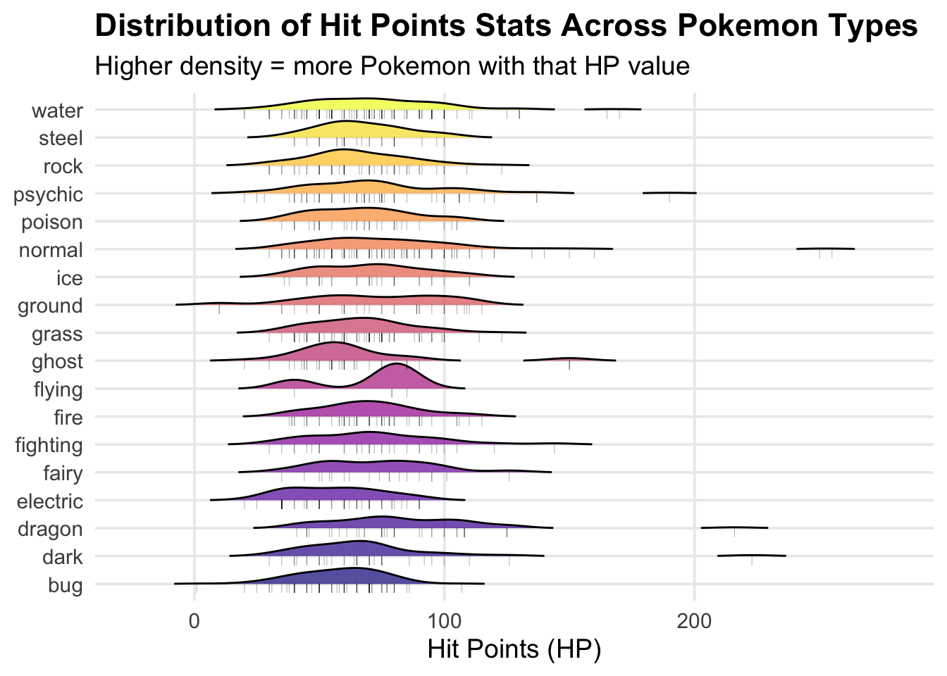
1: RIDGELINE PLOT
Visualizing the distribution of HP across different types
I am curious if certain types of pokemon have higher hit points that
others and the ridgeline plot allows me to visualize this!
pokemon_ridgeline <- ggplot(pokemon_clean,
  aes(x = hp,
      y = type_1,
      fill = type_1)) +
  # Code for creating the ridgeline plot
  geom_density_ridges(
    alpha = 0.7,
    scale = 0.9,
    rel_min_height = 0.01) +
  # Add jittered points
  geom_point(
    aes(y = as.numeric(factor(type_1)) - 0.15),
    alpha = 0.3,
    size = 1.5,
    shape = "|") +
  scale_fill_viridis_d(option = "plasma") + # could also do mako, rocket, turbo
  labs(
    title = "Distribution of Hit Points Stats Across Pokemon Types",
    subtitle = "Higher density = more Pokemon with that HP value",
    x = "Hit Points (HP)",
    y = NULL,
    fill = "Type") +
  theme_minimal(base_size = 14) +
  theme(
    legend.position = "none",
    plot.title = element_text(face = "bold"),
    panel.grid.minor = element_blank())

print(pokemon_ridgeline)
## Picking joint bandwidth of 8.48
# Save the plot as a manuscript quality pdf
ggsave("pokemon_ridgeline.pdf", pokemon_ridgeline, width = 12, height = 8, dpi = 300)
## Picking joint bandwidth of 8.48
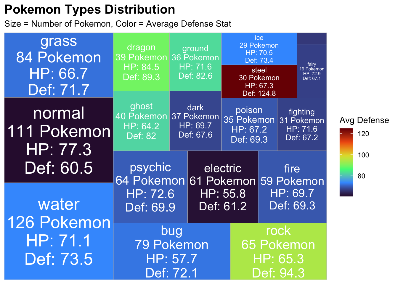
2. Treemap
I wanted to look at the different types of pokemon and their average
stats for defense, I wanted to know which pokemon type had the best HP
and defense stats.
treemap_data <- pokemon_clean %>%
  group_by(type_1) %>%
  summarize(
    count = n(),
    avg_hp = mean(hp, na.rm = TRUE),
    avg_attack = mean(attack, na.rm = TRUE),
    avg_defense = mean(defense, na.rm = TRUE),
    avg_speed = mean(speed, na.rm = TRUE),
    .groups = "drop") %>%
  arrange(desc(count))

# Create the tree map in ggplot!
treemap_pokemon <- ggplot(
  treemap_data,
  aes(
    area = count,
    fill = avg_defense,
    # this allows me to add labels to each of the blocks in the tree map for easier interpretation
    label = paste0(type_1, "\n", count, " Pokemon\n",
                   "HP: ", round(avg_hp, 1),
                   "\nDef: ", round(avg_defense, 1)))) +
  geom_treemap() +
  geom_treemap_text(
    colour = "white",
    place = "centre",
    size = 11,
    grow = TRUE) +
  scale_fill_viridis_c(option = "turbo") +
  labs(
    title = "Pokemon Types Distribution",
    subtitle = "Size = Number of Pokemon, Color = Average Defense Stat",
    fill = "Avg Defense"
  ) +
  theme_minimal() +
  theme(
    plot.title = element_text(face = "bold", size = 16),
    legend.position = "right"
  )

# it looks like steel pokemon have the best defense- makes sense!N Normal pokemon have the least amount of defense.
print(treemap_pokemon)
# Save the plot as a manuscript quality pdf
ggsave("treemap_pokemon.jpg", treemap_pokemon, width = 12, height = 10, dpi = 300)
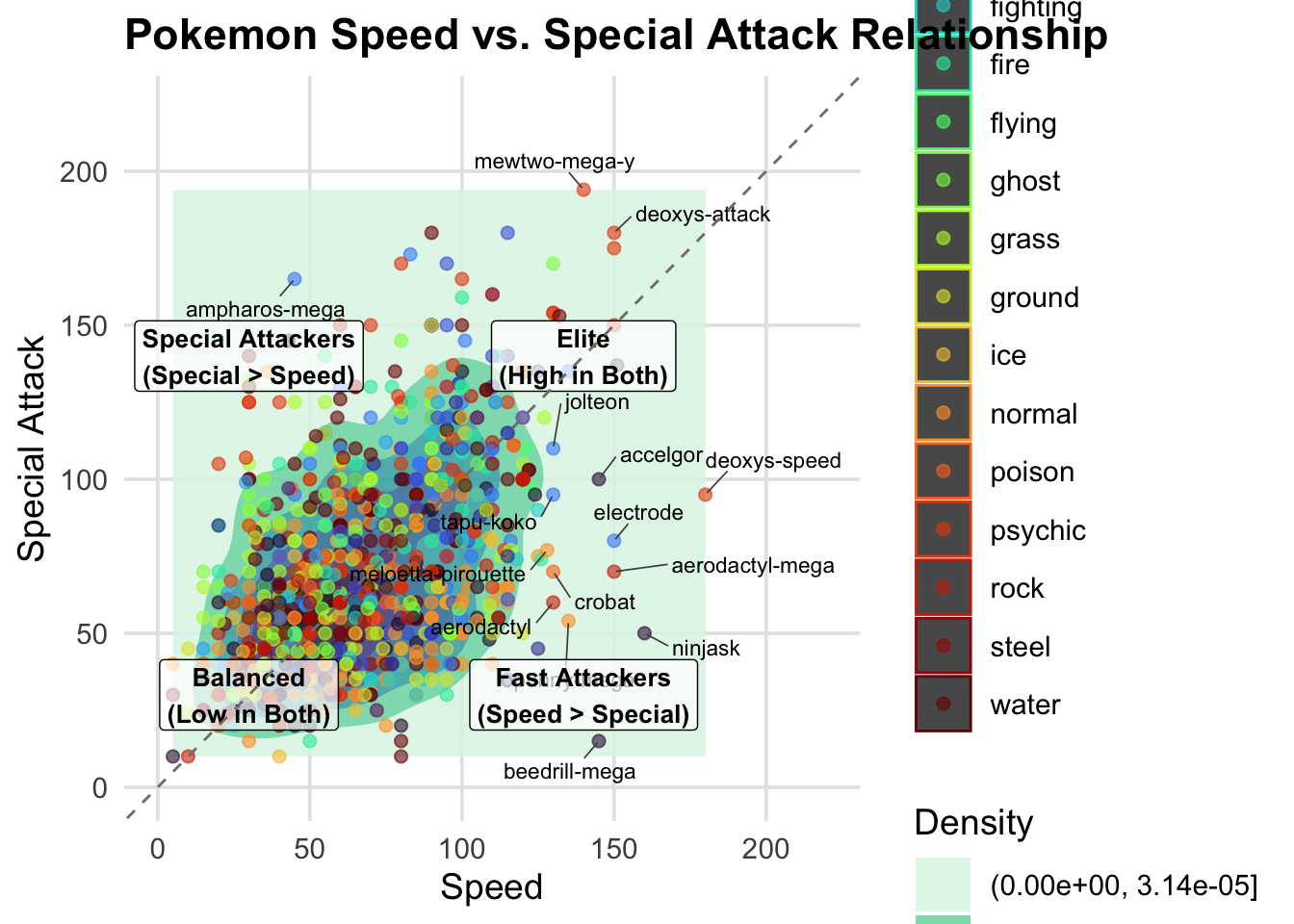
3. 2-D DENSITY PLOT
I am curious which pokemon have both high special attack and high
speed stat so I can choose the best pokemon in my upcmoing battles!
# first we need outliers for labeling purposes
outliers <- pokemon_clean %>%
  filter(
    # Fast pokemon
    speed > quantile(speed, 0.975, na.rm = TRUE) |
      # high special attack pokemon
      special_attack > quantile(special_attack, 0.975, na.rm = TRUE) |
      # Balanced pokemon
      (speed > quantile(speed, 0.9, na.rm = TRUE) &
         special_attack > quantile(special_attack, 0.9, na.rm = TRUE))
  )

# Now we can create the density plot
density_pokemon <- ggplot(
  pokemon_clean,
  aes(x = speed, y = special_attack)) +
  # Create the 2D density plot
  geom_density_2d_filled(alpha = 0.85, bins = 7) +
  # Add points with colors based on type
  geom_point(aes(color = type_1), size = 2, alpha = 0.6) +
  # Highlight notable outlier Pokemon
  geom_text_repel(
    data = outliers,
    aes(label = pokemon),
    size = 3,
    max.overlaps = 8,
    box.padding = 0.5,
    segment.color = "gray30",
    segment.size = 0.3) +
  # Custom aesthetics
  scale_fill_viridis_d(option = "mako", direction = -1) +
  scale_color_viridis_d(option = "turbo") +
  # Use more descriptive labels
  labs(
    title = "Pokemon Speed vs. Special Attack Relationship",
    x = "Speed",
    y = "Special Attack",
    fill = "Density",
    color = "Pokemon Type") +
  # I like the minimalistic theme for publicaitons
  theme_minimal(base_size = 14) +
  theme(
    plot.title = element_text(face = "bold"),
    legend.position = "right",
    panel.grid.minor = element_blank(),
    panel.grid.major = element_line(color = "gray90"),
    legend.key.size = unit(0.8, "cm")) +

  # Add quadrant labels
  annotate(
    "label",
    x = 140,
    y = 30,
    label = "Fast Attackers\n(Speed > Special)",
    fontface = "bold",
    size = 3.5,
    alpha = 0.7,
    color = "black") +
  annotate(
    "label",
    x = 30,
    y = 140,
    label = "Special Attackers\n(Special > Speed)",
    fontface = "bold",
    size = 3.5,
    alpha = 0.7,
    color = "black") +
  annotate(
    "label",
    x = 140,
    y = 140,
    label = "Elite\n(High in Both)",
    fontface = "bold",
    size = 3.5,
    alpha = 0.7,
    color = "black") +
  annotate(
    "label",
    x = 30,
    y = 30,
    label = "Balanced\n(Low in Both)",
    fontface = "bold",
    size = 3.5,
    alpha = 0.7,
    color = "black") +
  # Add a diagonal line
  geom_abline(
    intercept = 0,
    slope = 1,
    linetype = "dashed",
    color = "gray50") +
  # Set equal axis limits for better comparison
  coord_cartesian(
    xlim = c(0, 220),
    ylim = c(0, 220))

# Display the plot
print(density_pokemon)
## Warning: ggrepel: 31 unlabeled data points (too many overlaps). Consider
## increasing max.overlaps
# Save the plot as a manuscript quality pdf
ggsave("density_pokemon.pdf", density_pokemon, width = 12, height = 10, dpi = 300)
## Warning: ggrepel: 16 unlabeled data points (too many overlaps). Consider
## increasing max.overlaps
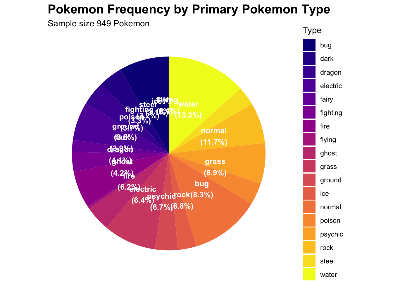
4. Pie Chart
I was curious what is the frequency of each type of pokemon and a
good way to visualize this was with a pie chart
# First we need to create a frequency for each of the types so we can put it on a pie chart
type_counts <- pokemon_clean %>%
  count(type_1) %>%
  arrange(desc(n)) %>%
  # Calculate percentages
  mutate(percentage = n / sum(n) * 100,
    # Create labels with percentages
    label = paste0(type_1, "\n(", round(percentage, 1), "%)"),
    # Add positions for pie chart labels
    position = cumsum(percentage) - 0.5 * percentage)

# Now we can make the pie chart
pie_pokemon <- ggplot(type_counts, aes(x = "", y = percentage, fill = type_1)) +
  # Create pie chart
  geom_bar(stat = "identity", width = 1) +
  coord_polar("y", start = 0) +
  geom_text(
    aes(y = position, label = label),
    color = "white",
    fontface = "bold",
    size = 3.5) +
  scale_fill_viridis_d(option = "plasma") +
  labs(
    title = "Pokemon Frequency by Primary Pokemon Type",
    subtitle = paste0("Sample size ", nrow(pokemon_clean), " Pokemon"),
    fill = "Type") +
  theme_minimal() +
  theme(
    axis.text = element_blank(),
    axis.title = element_blank(),
    panel.grid = element_blank(),
    plot.title = element_text(face = "bold", size = 16),
    legend.position = "right")

# it looks like that the types are pretty evenly distributed for all of the 949 pokemon
print(pie_pokemon)
# Save the plot as a manuscript quality pdf
ggsave("pie_pokemon.pdf", pie_pokemon, width = 12, height = 10, dpi = 300)